The 3-Second Rule: App Store Screenshot Optimization
You only have 3 seconds to convince users to download your app. Discover how to boost your conversion rates with updated 2026 screenshot sizes and ideal text density.
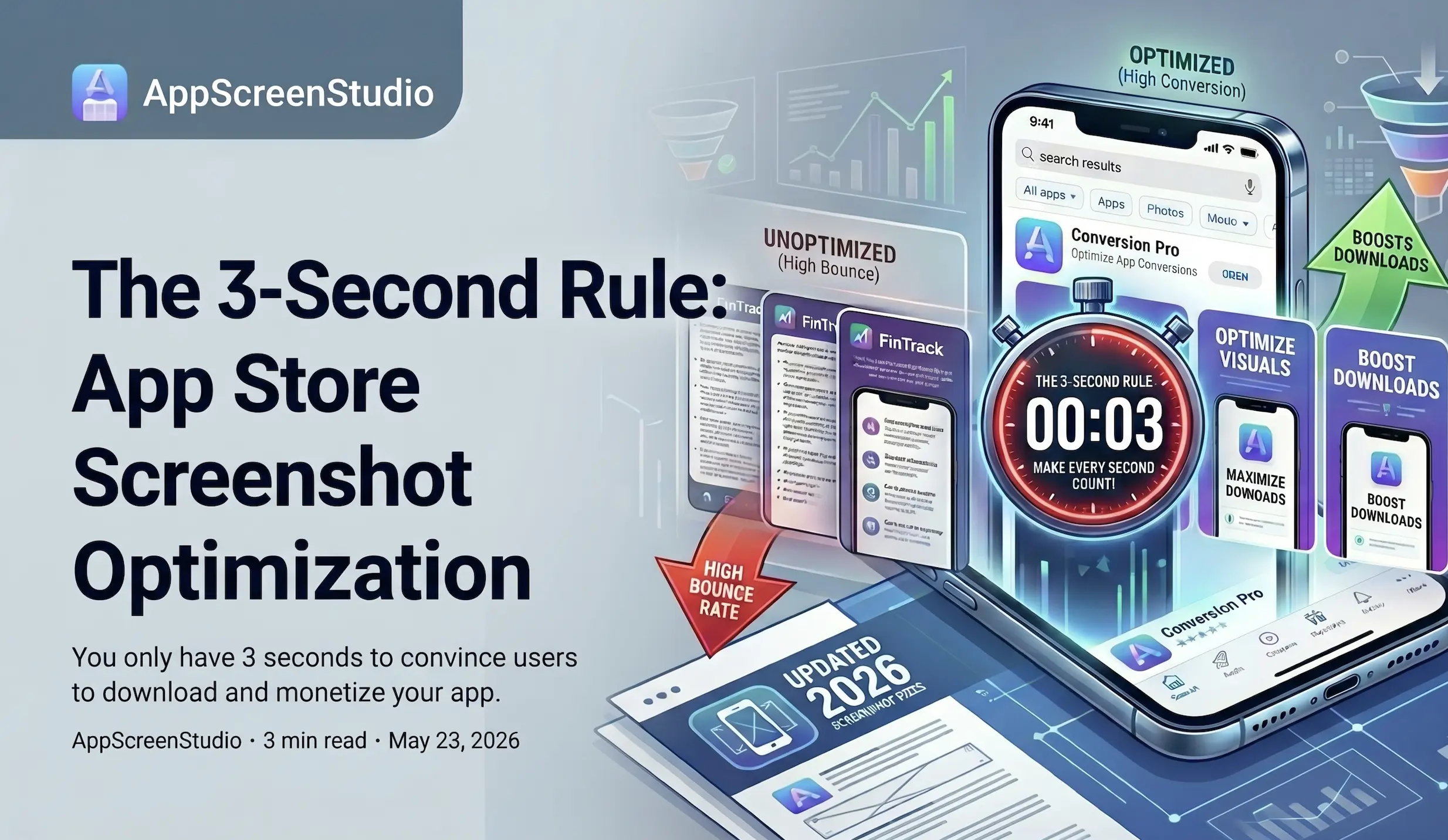
The 3-Second Window: Engineering App Screenshots for Conversion
You just spent months wrestling with state management, database migrations, and API rate limits to ship your app. The hard truth? Your potential users don’t care about your tech stack. When your app surfaces in an App Store or Google Play search result, you have roughly three seconds to convince them to tap "Get".
App Store Optimization (ASO) isn't just about keyword stuffing; it’s a visual conversion funnel. If your first three screenshots fail to communicate immediate value, your bounce rate spikes. Here is a pragmatic look at how to engineer your screenshots for that crucial three-second window, specifically focusing on typography and text density.
Why the First 3 Seconds Dictate Your CAC
On iOS, search results display your first three portrait screenshots (or one landscape video/image). Google Play has a similar layout depending on the search context. The user is scanning, not reading. They are looking for pattern matching: Does this app solve my specific problem?
If your first screenshot is just your logo or a generic splash screen, you are wasting the most expensive real estate in your funnel. The first image must act as a hard-hitting value proposition. The second and third should prove that value through core features.
Text Density: Stop Documenting Your App
A common mistake developers and indie hackers make is treating screenshots like a README file. They try to list every feature, integration, and edge-case solution. This results in a wall of text that is completely illegible on a 6.1-inch screen.
Here are the technical constraints you need to design for:
- The 5-7 Word Limit: Humans can process a short phrase in a fraction of a second. Aim for a maximum of 5 to 7 words per screenshot. e.g., "Track workouts in one tap" instead of "Use our comprehensive dashboard to monitor your daily fitness routines and analyze your historical data."
- Font Scaling and Contrast: Your text must be readable at a glance on a device held at arm's length, potentially at 50% brightness in sunlight. Use heavy, sans-serif fonts. Ensure high contrast between your text and the background. If you have to squint, your users will just scroll.
- Visual Hierarchy: Treat the text as a headline. The UI mockup inside the device frame is the supporting evidence. Do not clutter the negative space with sub-bullets.
The Tooling Bottleneck: Why Manual Design Fails at Scale
Understanding ASO best practices is one thing; executing them across multiple device sizes and languages is another. Most developers default to general-purpose design tools.
While Figma is the industry standard for product design, using it for ASO is highly inefficient. Maintaining separate artboards for iOS 6.9", 6.5", 5.5", iPad 12.9", plus Google Play dimensions—and then multiplying that by 5 or 10 localizations—creates a brittle, manual workflow. A single copy change requires updating dozens of nodes and manual exports.
Similarly, tools like Canva are built for generic social media graphics. Their free tiers and basic workflows lack the programmatic device framing and automated localization necessary for a continuous App Store deployment pipeline.
If you want to iterate on your screenshot copy to test conversion rates (A/B testing that 3-second hook), you need infrastructure built specifically for ASO. By moving away from manual pixel-pushing to automated screenshot generation, you can focus on what actually moves the needle: finding the exact 5 words that convert scrollers into active users.